

Škoda Mobile App UX improvement
RESEARCH, EMPATHIZE AND ANALYSIS
Understanding the user points and needs.
I started the project by analyzing the reviews of the application on the Google play store and Apple app store. Since more than 75 thousand users rated the app there, it seemed like a great source of information. I focused only on complains that can be improved in terms of UX.
1. App Store Reviews Analysis
- Average rating: 3.2★ (Android), 3.4★ (iOS)
- Common complaints:
- Login/logout bugs
- Confusing layout
- Poor vehicle status sync
2. Competitor Benchmarking
- BMW Connected, Mercedes me, MyPeugeot, Tesla app
- Key learnings:
- Clean, modular dashboards
- Emphasis on remote vehicle controls
- Seamless EV support (battery %, smart scheduling)
DEFINE USER NEEDS AND THE PAIN POINTS
Key Insights
- Users prioritize quick access to status and remote functions (lock/unlock, climate)
- EV users demand battery-centric design
- App should feel like a “digital cockpit companion”, not a basic tracker
- Contextual information (weather, traffic, charger availability) is key
IDEATE
Helping meet the user expectations.
Brainstorming also with other members of the team, marketing ,engeneering,product manager/leader try to explore the possible solutions.
Can do another research if necessery.
Wireframe
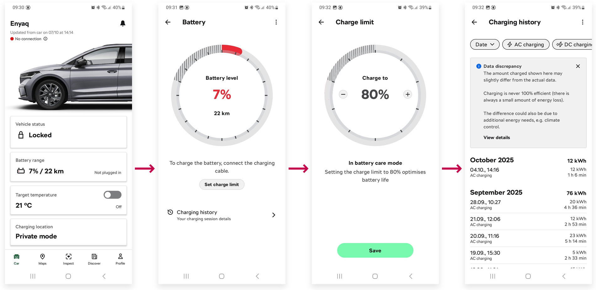
Current DesignUsers need to click twice to change the charging limit.
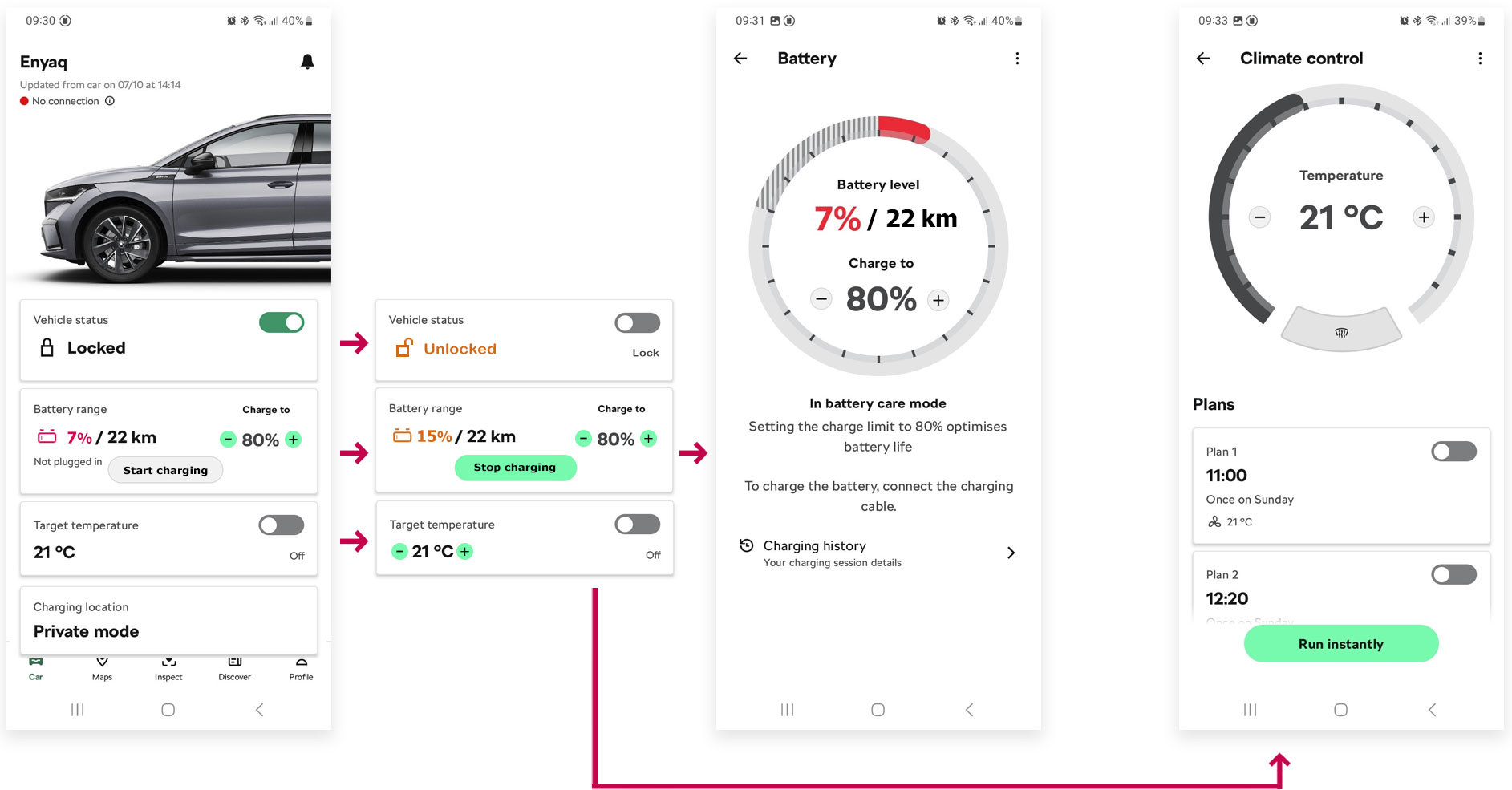
 Improved Design
The user can change the charge limit and the temperature directly on the home page. I also added a button to stop charging the car on the home page. When the battery level is 10% or less, it becomes red; when it is 20% or lower, it becomes orange; otherwise, it is green.
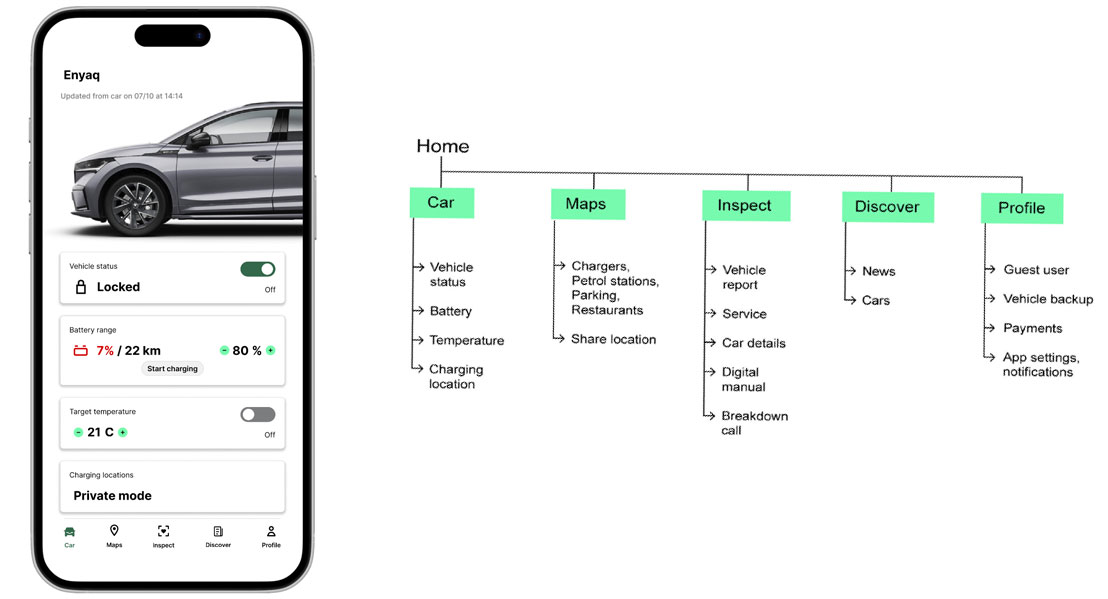
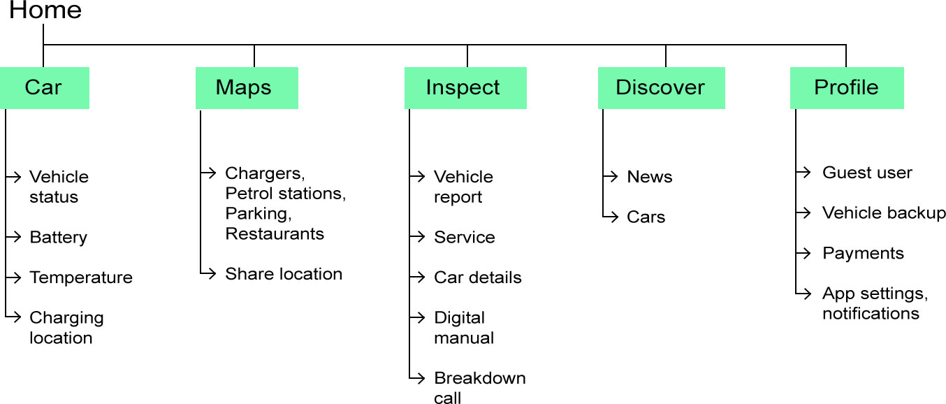
Information Architecture
High Fidelity Prototype
CLICKABLE PROTOTYPE
Click around the app here ![]()